Black and White Street Photography: Why It Works So Well on the Street
Street photography often happens in conditions that are visually messy. A good street scene can contain too much at once: bright shop signs, mismatched clothing, reflective glass, traffic signals, hard midday light, deep shadows, people crossing in different directions, and backgrounds that keep competing with the subject. In that environment, black and white can do something very useful. It can reduce distraction and make the structure of the image easier to read.
That is the real reason black and white street photography remains so strong. Not because monochrome is automatically more artistic. Not because it makes a photo serious by default. And not because the street somehow belongs to the past. Black and white works when it helps the photograph breathe. It can clarify form, strengthen contrast, isolate gesture, and turn a crowded scene into something legible.
For photographers trying to understand why monochrome has such a deep place in the tradition of street photography, the answer is practical before it is emotional. Black and white changes emphasis. It asks the viewer to pay less attention to color information and more attention to light, spacing, timing, silhouette, texture, and human presence. On the street, that shift can be powerful.
Why black and white has always stayed close to street photography
Black and white has a strong historical relationship with street photography, but the deeper reason is not nostalgia. It is visual efficiency.
Street photography has always involved quick decisions in uncontrolled public spaces. You do not arrange people, rewrite the light, or remove distracting objects. You work with what appears in front of you. In those conditions, black and white helps compress complexity. It strips the image down to relations between tones, shapes, and movements.
This is one reason so many classic street photographs remain convincing today. Their strength is rarely based on color. It is based on structure. A strong figure against a bright wall. A shadow cutting through a pavement. A repeated rhythm of windows broken by one human gesture. A face turning at the right moment inside a busy frame. These are not nostalgic ideas. They are visual ones.
That logic still matters now, even in cities filled with digital screens and saturated advertising. In fact, it may matter even more. Contemporary streets can be noisier than ever. Black and white can give a photographer a way to organize that noise.
This does not mean color has less value. It means black and white has remained close to street photography because the street is full of competing information, and monochrome is one of the clearest ways to control how that information is read.
What black and white changes in a street image
The most important thing black and white does is remove one layer of meaning.
Color is never neutral. It pulls the eye, creates mood, suggests temperature, separates objects, and sometimes becomes the subject itself. When you remove it, the image stops speaking through hue and starts speaking more through tone and arrangement.
That changes the way a street photograph is read in several ways.
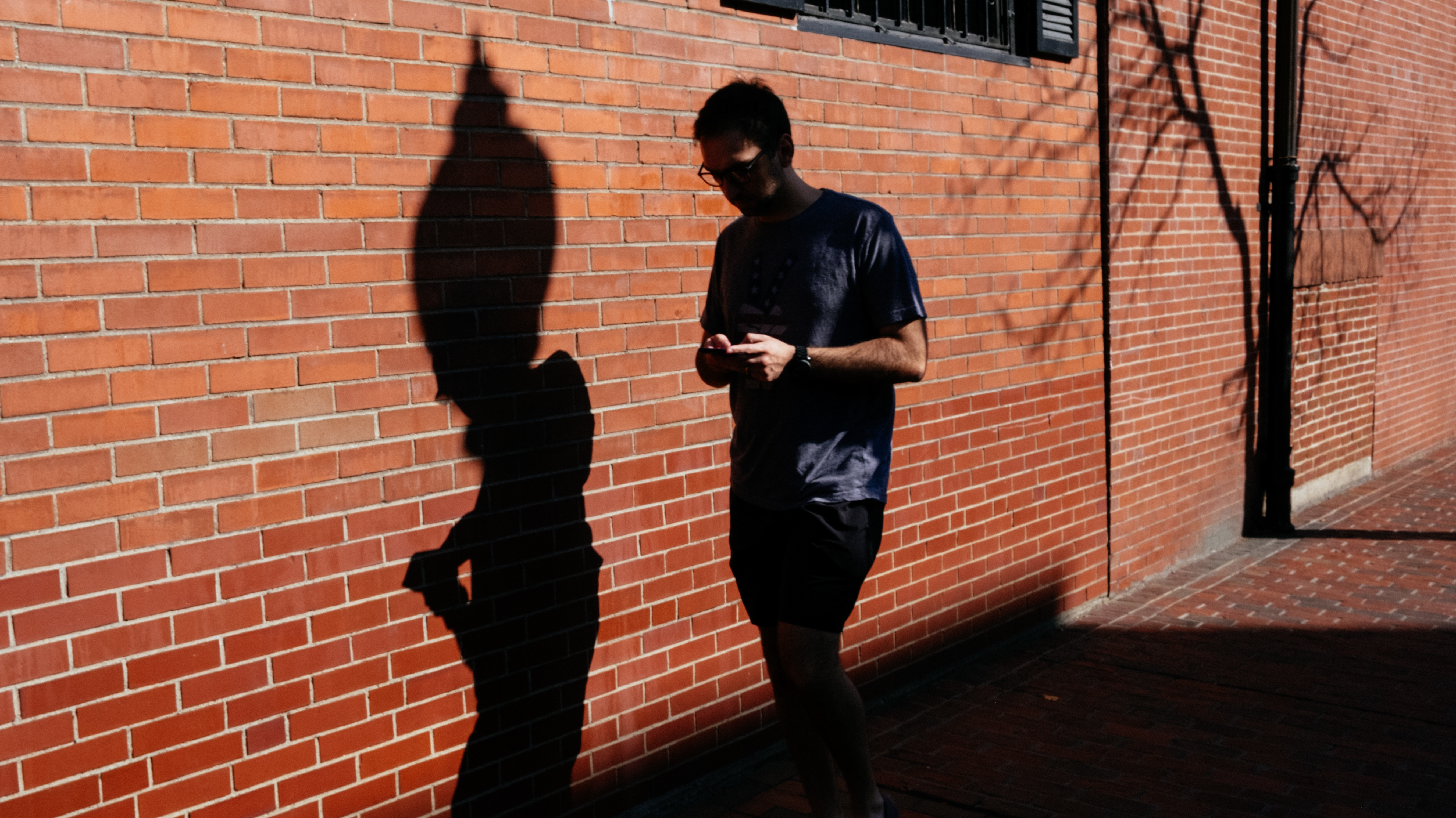
First, tonal contrast becomes more important. Bright and dark areas begin to carry more weight. A person in a dark coat against a pale wall can suddenly become the entire picture.
Second, edge relationships become clearer. In color, adjacent elements may differ through hue even if their brightness is similar. In black and white, those relationships have to hold through tonal separation. This often reveals whether the composition is actually working.
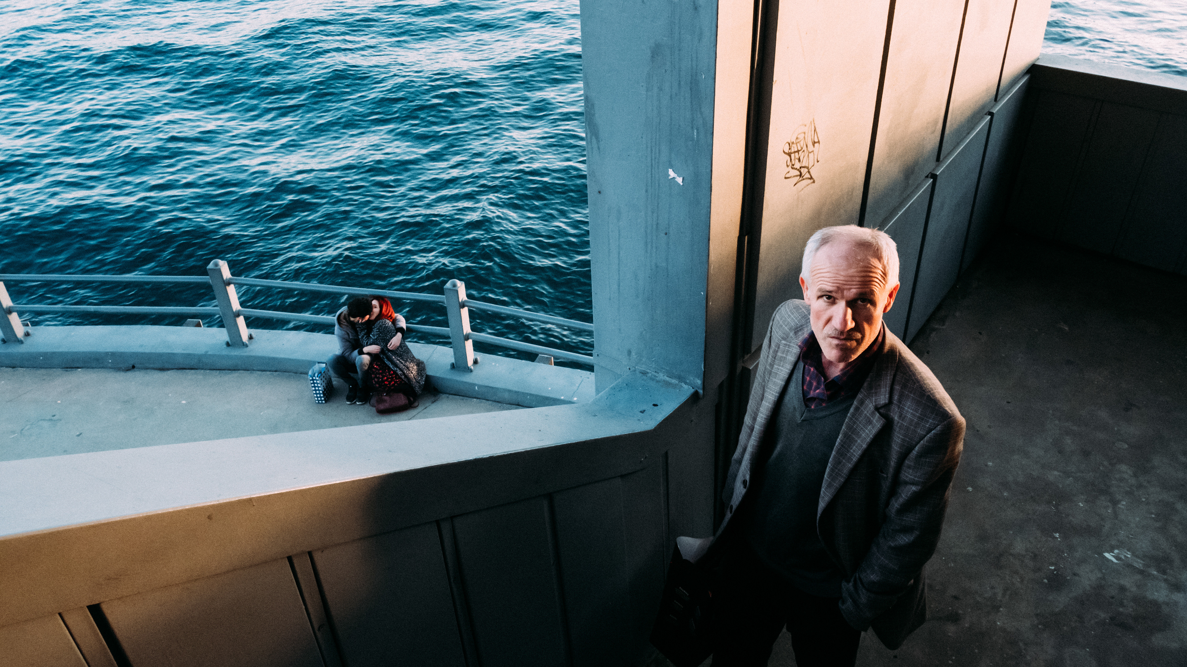
Third, gesture becomes more visible. When loud colors disappear, body language has more space. A hand movement, a turn of the head, the angle of a shoulder, or the tension between two people can become easier to notice.
Fourth, texture rises to the surface. Rain on pavement, worn stone, smoke, fog, wrinkles, concrete, tram windows, umbrellas, winter coats, architectural facades, and reflected light can all become more tactile in monochrome.
What black and white does not do is rescue a weak image. If the photograph has no structure, no timing, no tension, and no meaningful visual relationship, removing color will not fix it. It may only hide the problem temporarily.
Light, shadow, shape, and gesture
Street photography often becomes strongest when the image can be read quickly and deeply at the same time. Black and white supports that by making a few core visual elements more prominent.
Light becomes structure
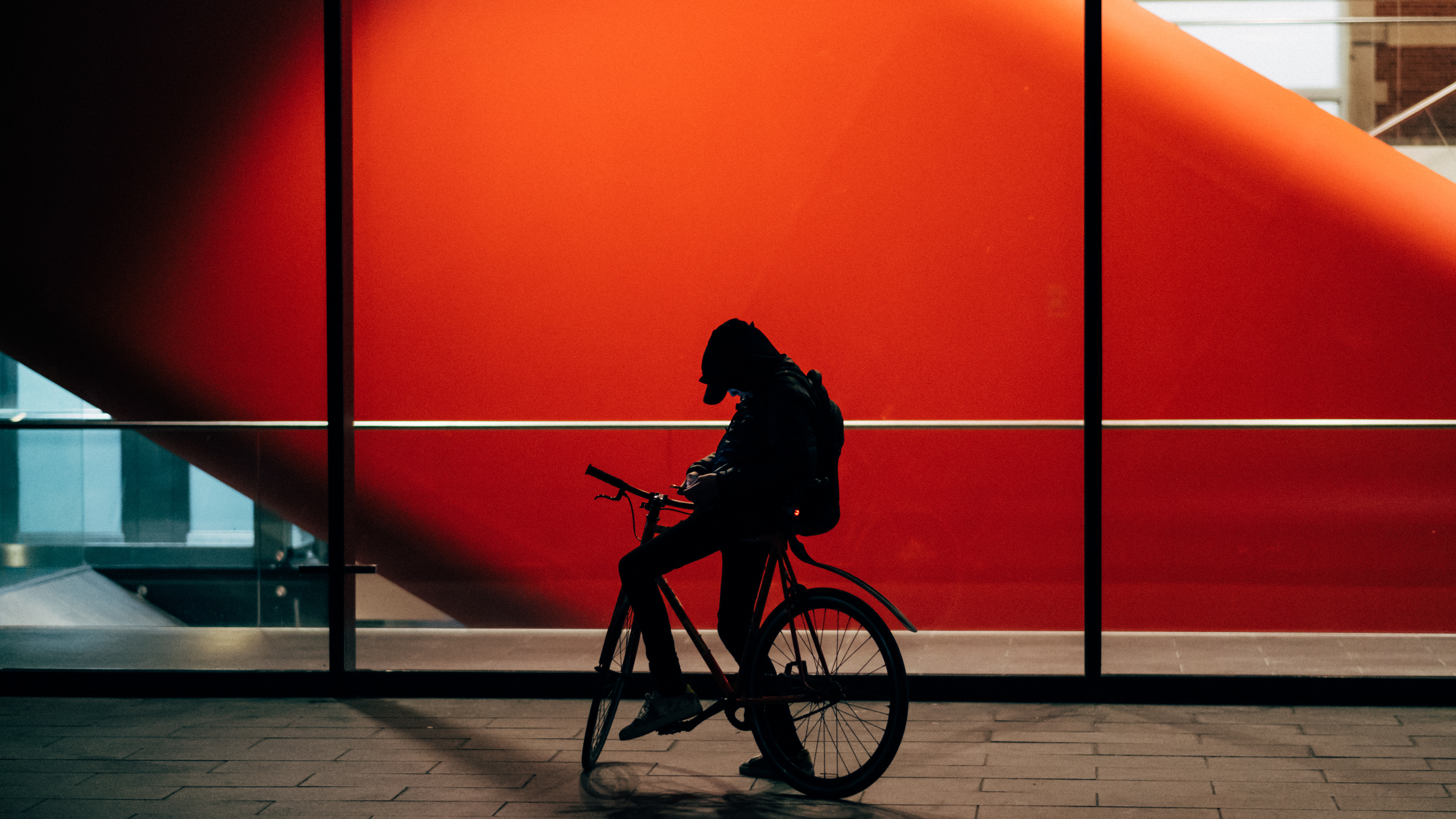
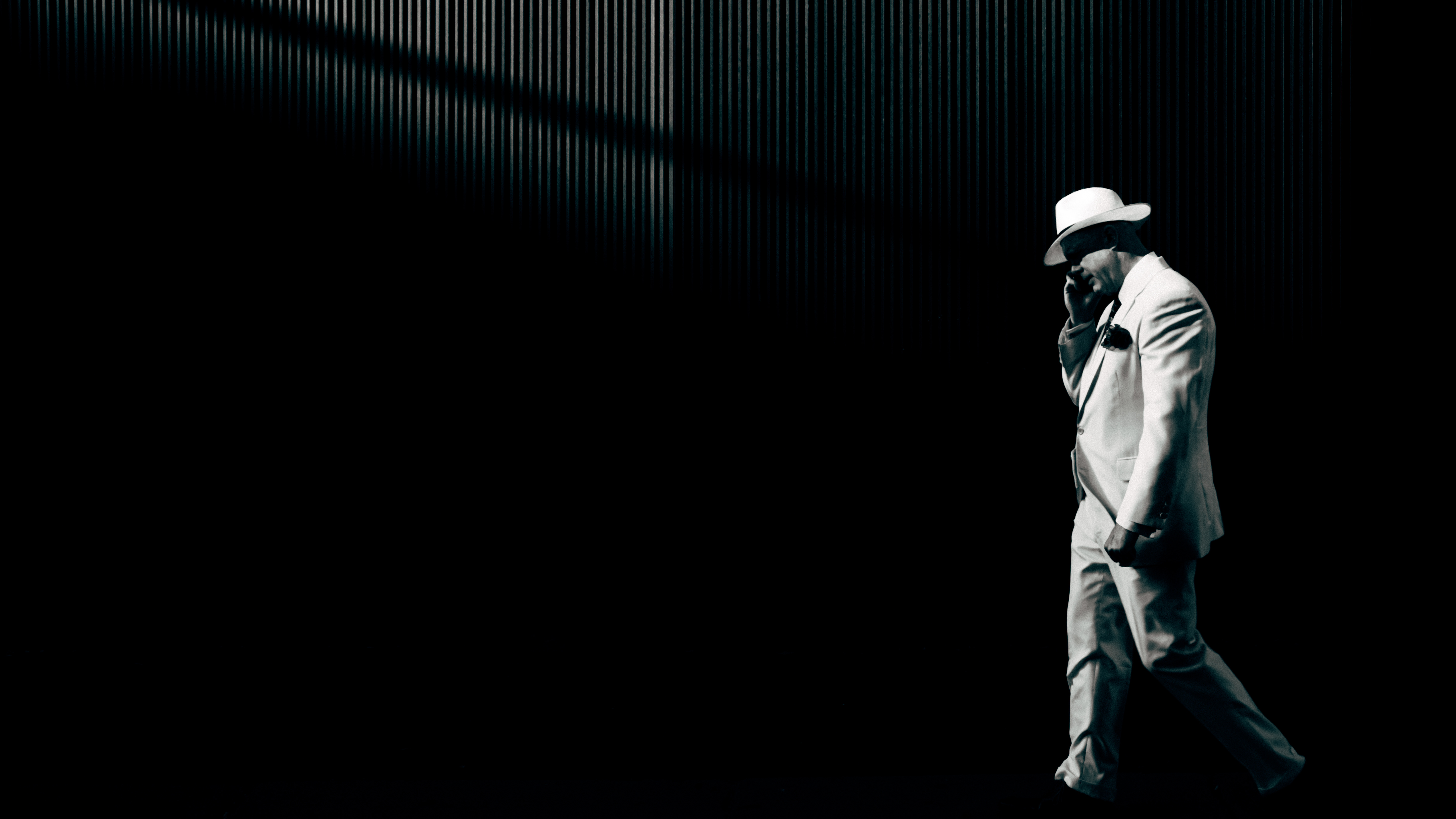
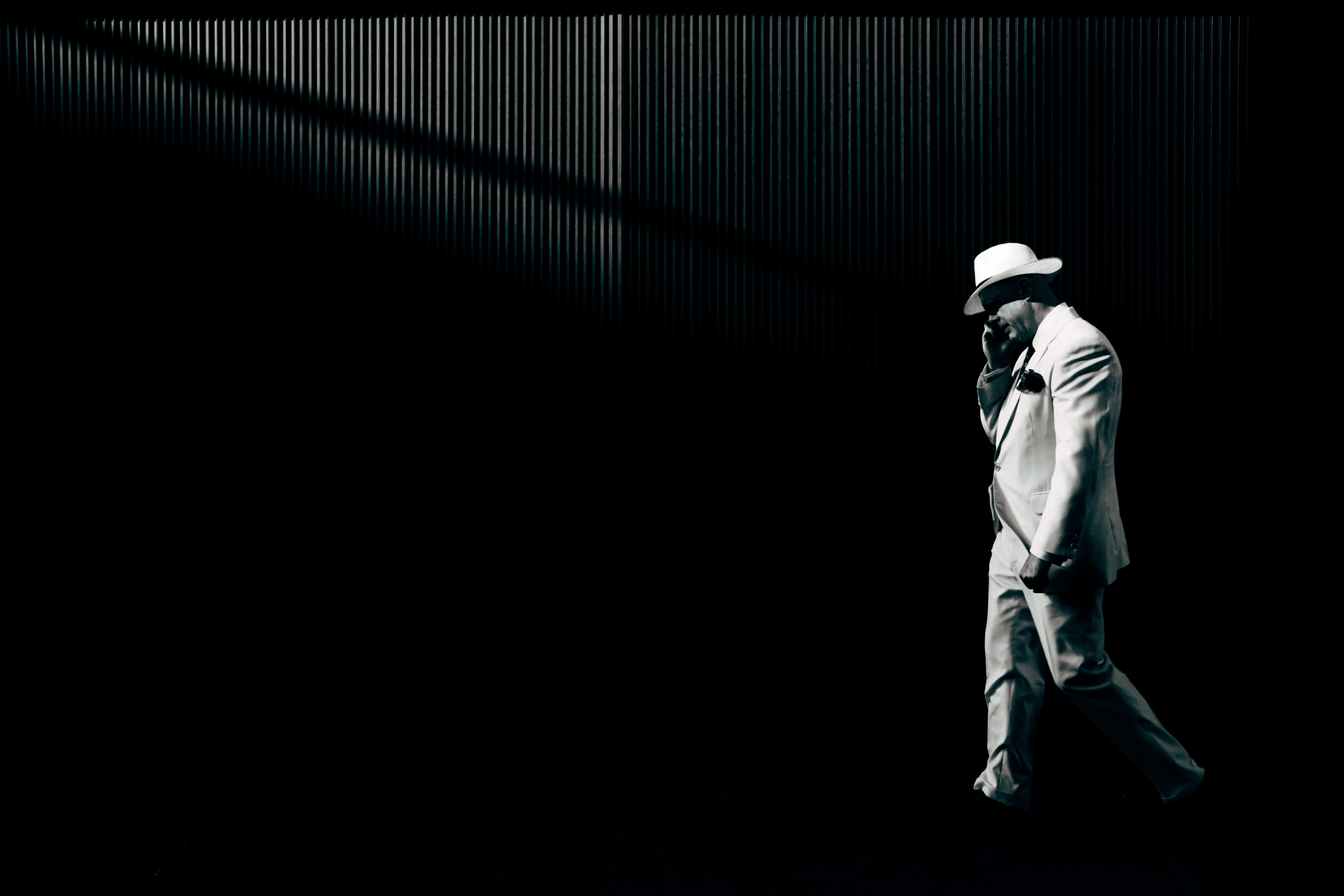
In monochrome, light is not just atmosphere. It becomes architecture inside the frame. A shaft of sun across a sidewalk can divide the image into active and inactive zones. A face catching light in a crowd can become the clear point of focus. Hard contrast can simplify a scene into large readable masses.
This is why black and white often works so well in difficult urban light. Midday sun, backlight, reflections in shop windows, and deep shadows under arcades can all become compositional tools rather than problems.
Shadow becomes a subject
In color photography, shadows can support the image. In black and white, they can define it. A shadow can lead the eye, hide information, create ambiguity, or turn an ordinary wall into a graphic stage. On the street, where buildings, traffic, and bodies constantly shape light, shadow is often the quickest path to abstraction without losing reality.
Shape becomes cleaner
Monochrome often strengthens shapes because it removes the distraction of surface description. A hat, a coat, a bicycle wheel, a dog leash, a staircase, or a tram door can become part of a cleaner visual rhythm. This matters in cities, where architecture and human movement constantly overlap.
Gesture becomes more legible
Street photography depends heavily on gesture. A small movement can carry the whole image. Black and white often helps because it directs attention away from decorative detail and toward posture, direction, and interaction. You notice the pause, the hesitation, the stride, the glance, the lean, the brief alignment.
When photographers say a black and white street photo feels strong, they often mean that the human gesture reads clearly inside the visual design.
Black and white as a way to simplify visual chaos
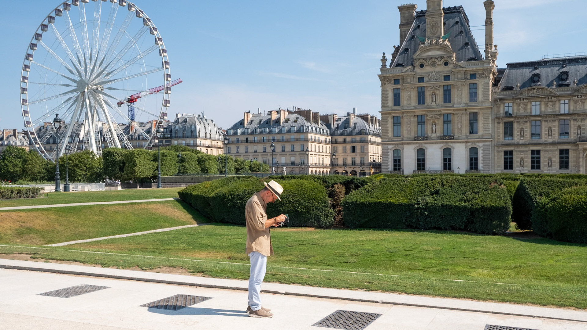
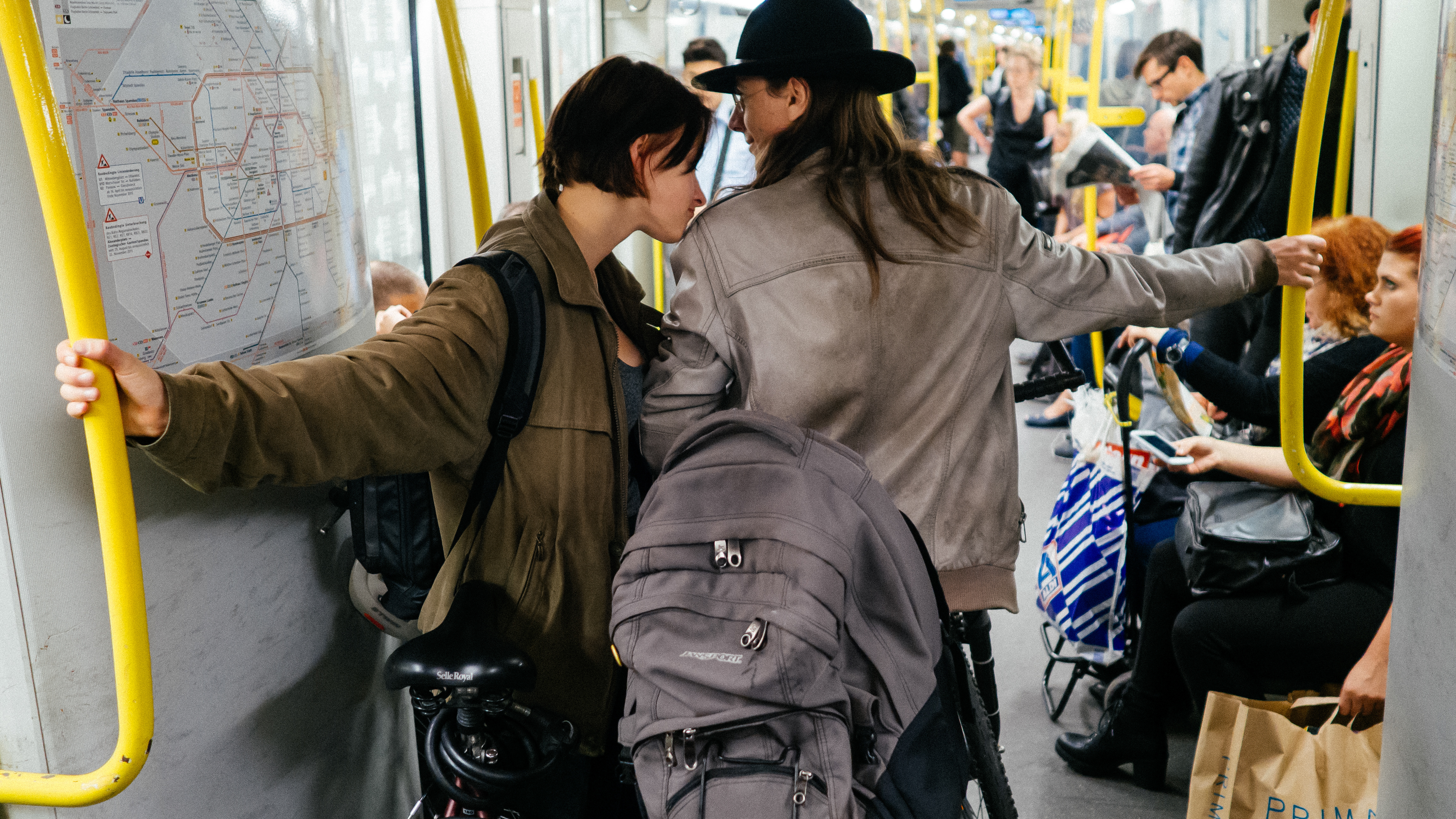
The street rarely gives you clean backgrounds. Even in beautiful cities, the frame fills up quickly. Signs, parked cars, café furniture, passersby, construction barriers, reflections, bicycles, menu boards, and random patches of color can all start competing for attention.
Black and white can simplify that chaos, but it does so in a specific way. It reduces difference by translating many competing colors into a narrower tonal language. Suddenly, the red jacket, green sign, blue awning, and yellow bus stop do not all shout at once. They become light gray, dark gray, white, black. The image is not necessarily simple, but it becomes more coherent.
This is especially useful in layered street scenes. If you like photographing through windows, across tram lines, inside arcades, or through overlapping crowds, black and white can help hold the frame together. It can also help in bad weather, where wet surfaces, fog, and low contrast light create subtle tonal relationships that become richer without color.
In practice, this means monochrome often rewards photographers who are attentive to frame structure. It makes you ask better questions: Where is the weight in the image? Which areas need separation? Is the subject distinct enough? Are the edges controlled? Does the background support the moment or fight it?
That is why black and white street photography is often less about style than about editing judgment. Good monochrome images feel reduced, but not emptied. They keep enough complexity to remain alive while removing the kinds of distractions that weaken attention.
When black and white works better than color
Black and white tends to be the stronger choice when the photograph depends more on form than on hue.
It often works better than color in situations like these:
Busy public scenes with distracting color
Crowded markets, station exits, shopping streets, and tourist-heavy areas often contain random color that adds noise but not meaning. If the image is really about spacing, rhythm, and movement, monochrome may strengthen it.
Strong directional light
Harsh sunlight, long shadows, silhouettes, reflected highlights, and graphic light patterns often gain force in black and white because tonal contrast becomes the main event.
Architecture-heavy frames
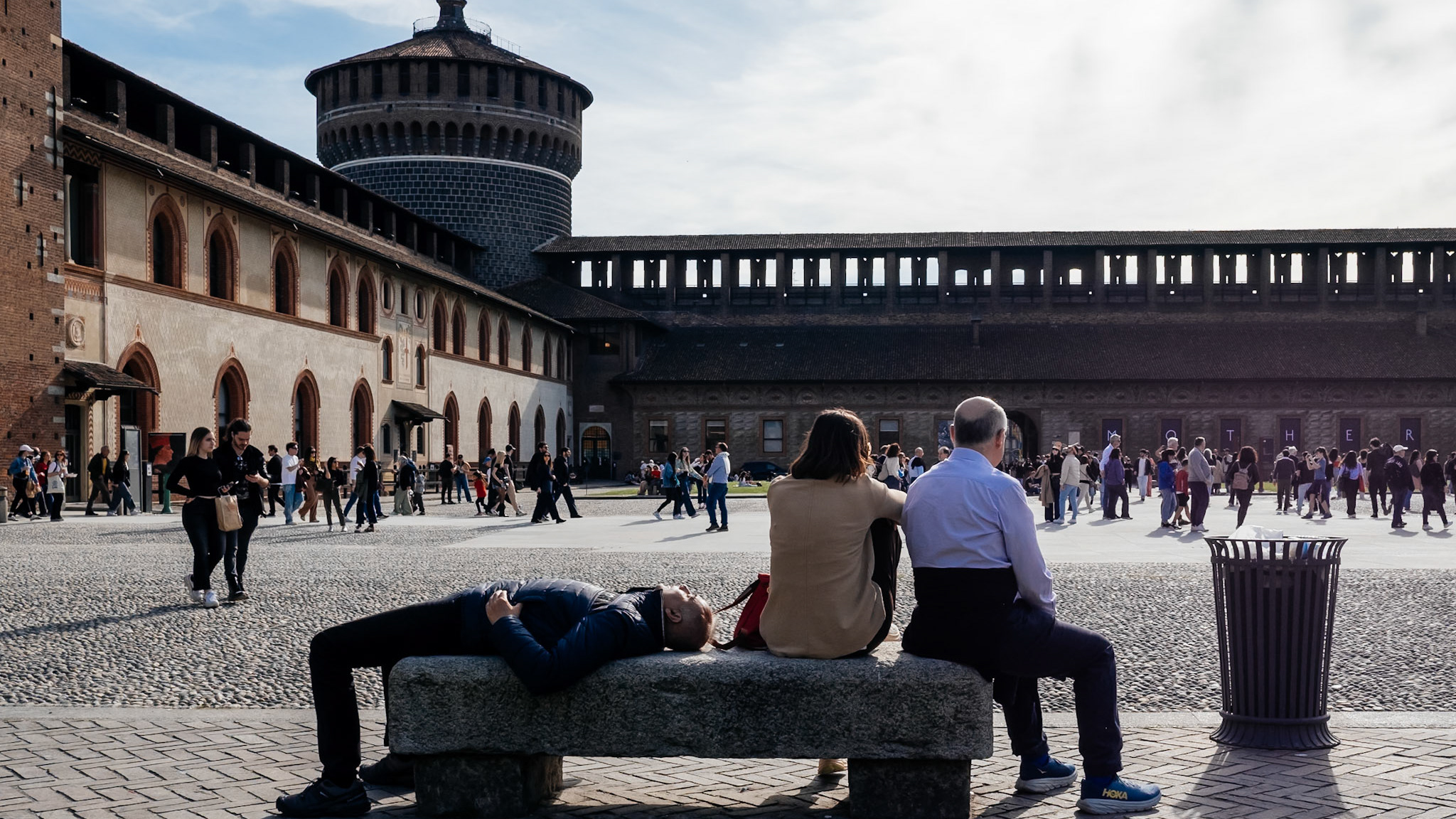
In cities like Milan, where arcades, stone facades, tram lines, glass, symmetry, and narrow passages can play a strong role, black and white can unify people and built space into the same visual language.
Images built around gesture or timing
If the photograph depends on a glance, a step, a crossing path, or a fleeting alignment, color may be secondary. Removing it can make the timing more immediate.
Weather, texture, and atmosphere
Rain, mist, winter light, and reflective pavement can all become more tactile in monochrome, especially when the scene already has a restrained emotional temperature.
When color is the stronger choice
There are many moments when converting to black and white weakens the photograph.
Color is the stronger choice when color itself is part of the image’s logic. That can mean several things.
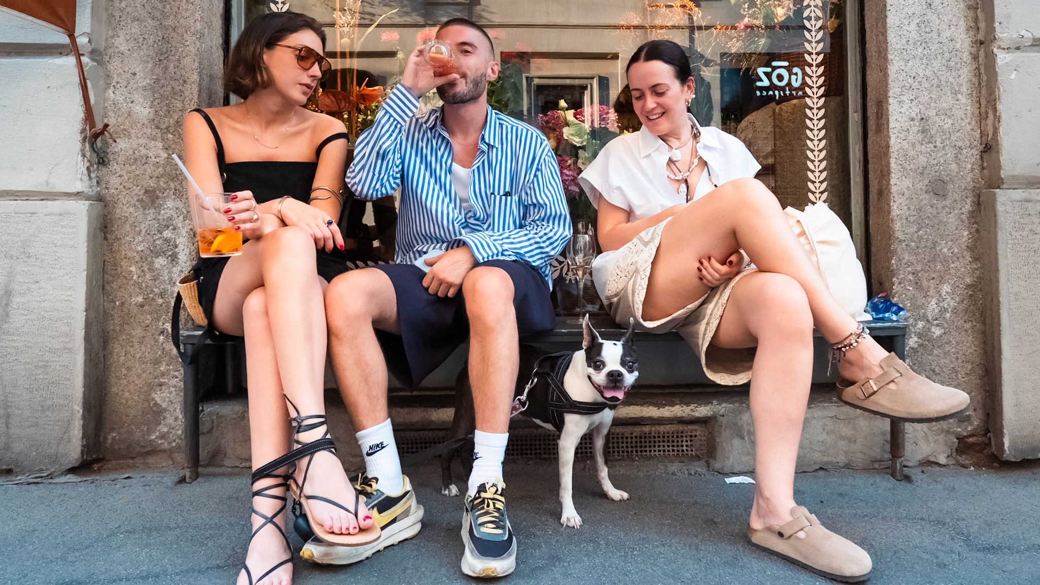
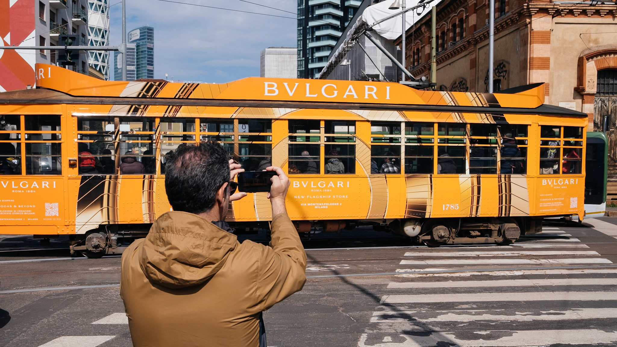
If the tension comes from a red umbrella passing a green tram, color matters. If the photograph depends on fashion, signage, neon, seasonal decoration, skin tone relationships, or a specific urban mood created by hue, monochrome may flatten what makes the image interesting.
Color also matters when it creates separation. Sometimes a subject stands out precisely because of a color relationship. Converting the image may collapse foreground and background into similar tones and make the composition less readable.
Street photography in color can also describe a city in a different way. Some places speak through palette. Night scenes, convenience stores, supermarket interiors, traffic lights, plastic surfaces, advertising, and contemporary consumer spaces often lose something important in black and white. The same is true for photographs where warmth, artificial light, or chromatic tension carry the emotional charge.
A useful question is this: if I remove color, does the photograph become clearer or merely emptier? If it becomes emptier, keep the color.
Common misconceptions about monochrome street photography
Black and white is more artistic
Not necessarily. Black and white is a visual choice, not a shortcut to seriousness. A weak photo in monochrome is still weak. Sometimes it just looks more protected because the absence of color feels intentional.
Black and white captures emotion better
Emotion comes from the photograph’s content, timing, distance, and form. Monochrome can focus attention, which may intensify feeling, but it does not create emotional depth by itself.
Converting to black and white fixes clutter
Only if the clutter is mostly chromatic. If the frame is messy because the composition is loose, the subject is unclear, or the background is chaotic in tone and shape, monochrome may not help much.
Black and white is more authentic to street photography
Street photography is not defined by monochrome. It is defined more by observation, timing, public space, and the photographer’s response to real life. Color street photography has produced just as much serious work. The question is not which is more authentic. The question is which one tells this picture better.
How beginners should think about shooting or editing in black and white
Beginners often approach black and white as an afterthought or as a preset. A better approach is to treat it as a way of seeing.
When shooting, try to notice tonal relationships before you press the shutter. Ask yourself where the brightest and darkest parts of the frame are. Ask whether the subject separates clearly. Ask whether the light is doing enough work.
If your camera allows it, using a monochrome preview can help train your eye, even if you are recording RAW files. It encourages you to pay attention to contrast, shape, and gesture rather than decoration.
When editing, avoid the common mistake of pushing everything too far. Heavy contrast, crushed blacks, glowing clarity, and dramatic presets can make a street image feel forced. Good black and white editing usually depends on control. You want separation, not noise. Presence, not theatrical effect.
It also helps to compare the color and monochrome versions honestly. Do not assume black and white is the refined option. Sometimes the color file contains the real intelligence of the frame. Sometimes monochrome reveals it. Your job is to decide which version makes the visual argument more clearly.
For beginners, one of the best exercises is to review your own images in both versions and ask specific questions:
-Does black and white improve the structure?
-Does it strengthen the subject’s gesture?
-Does it make the frame calmer or just flatter?
-Is color carrying meaning here?
-What is the photograph actually about?
That last question matters most. Black and white works best when it is answering the image, not decorating it.
Conclusion
Black and white street photography works so well because the street is full of excess. Too many signals, too many surfaces, too many interruptions. Monochrome gives the photographer a way to reduce that excess and direct attention toward what matters most: light, spacing, shape, tension, gesture, and timing.
That is why black and white has remained so central to street photography. Not because it automatically improves a scene, and not because it grants artistic depth on arrival, but because it often helps the image become more coherent. It can make public life easier to read without making it simpler than it really is.
The important thing is judgment. A strong monochrome street photograph is not strong because it is black and white. It is strong because black and white serves the structure of the picture. When that happens, the photograph stops depending on surface attraction and starts holding itself together through visual logic. On the street, that kind of clarity is hard to fake and worth learning to see.